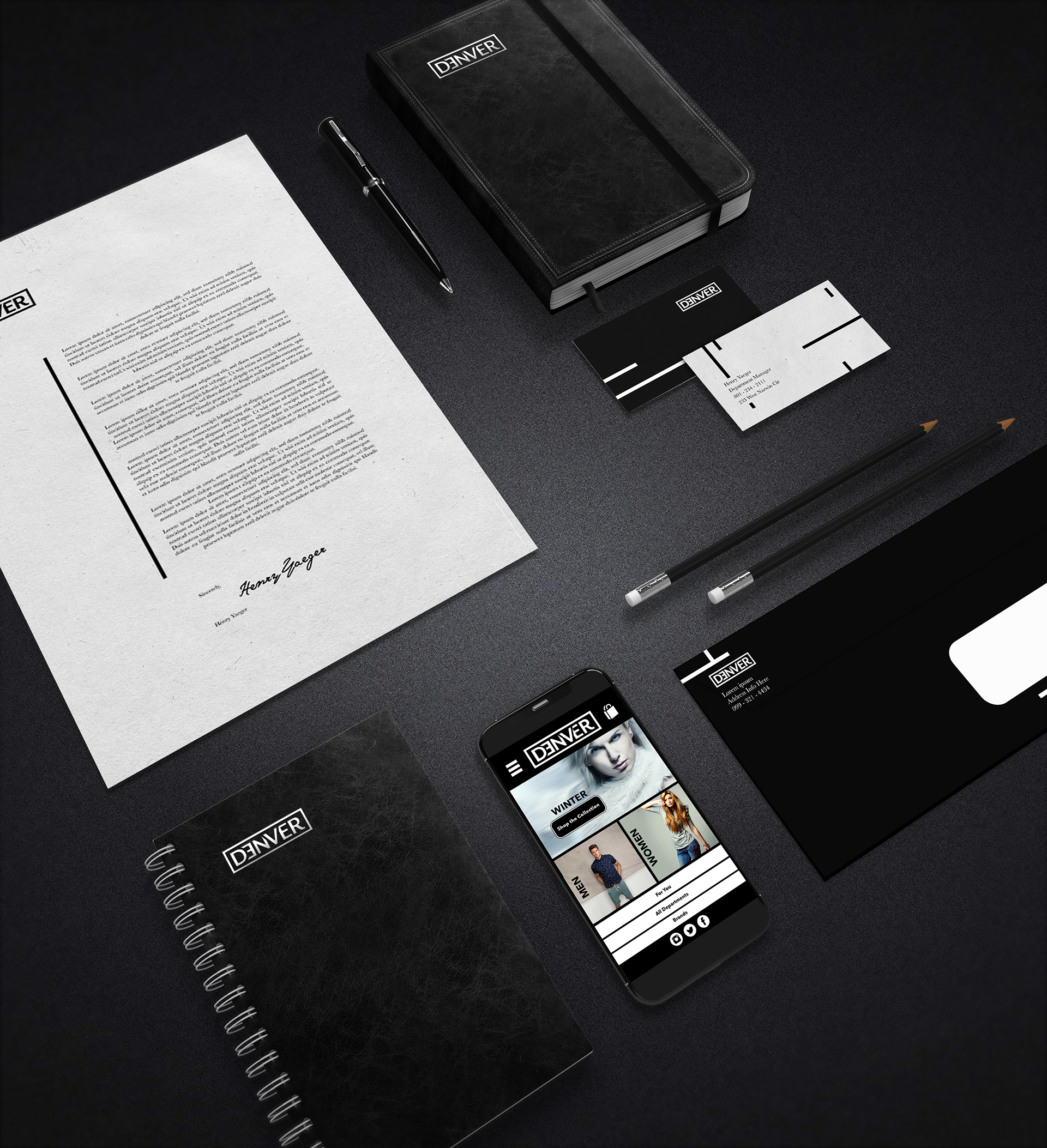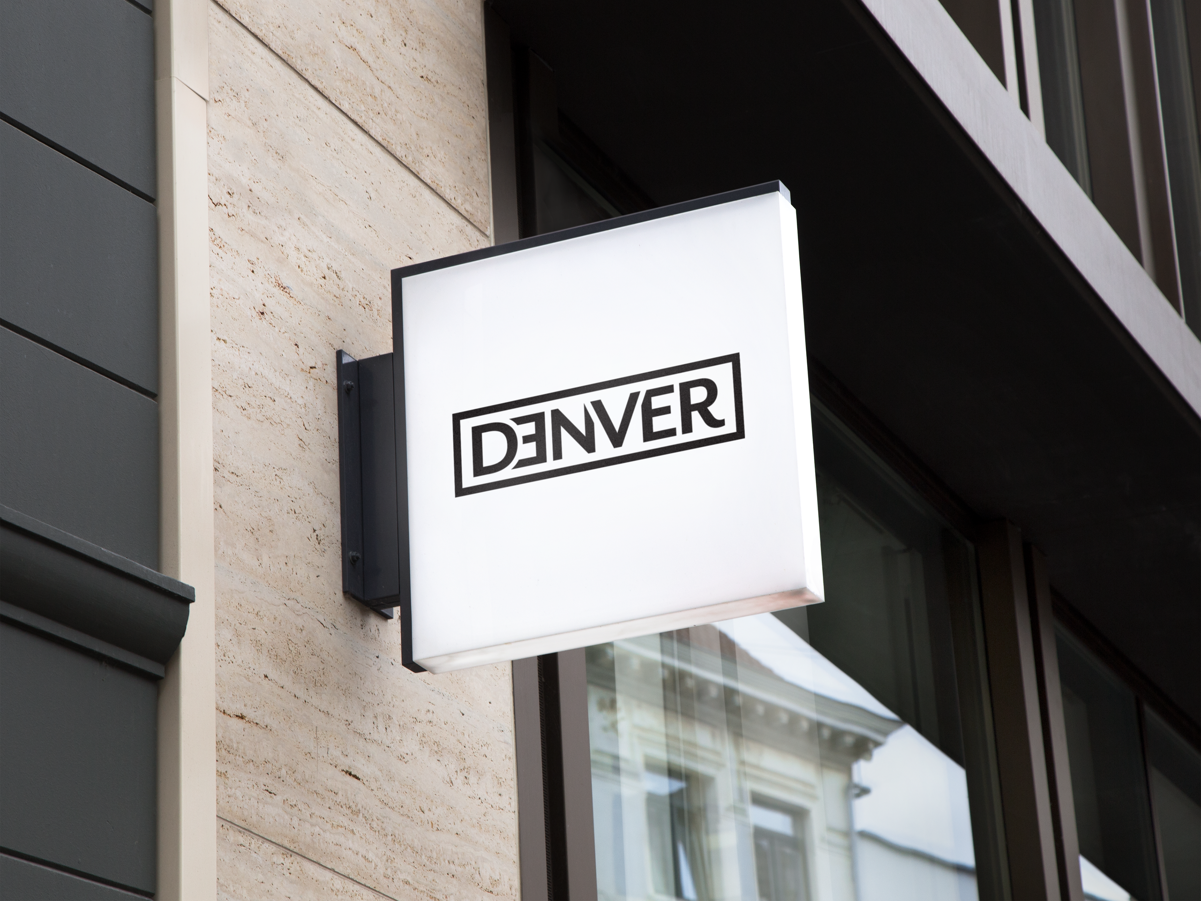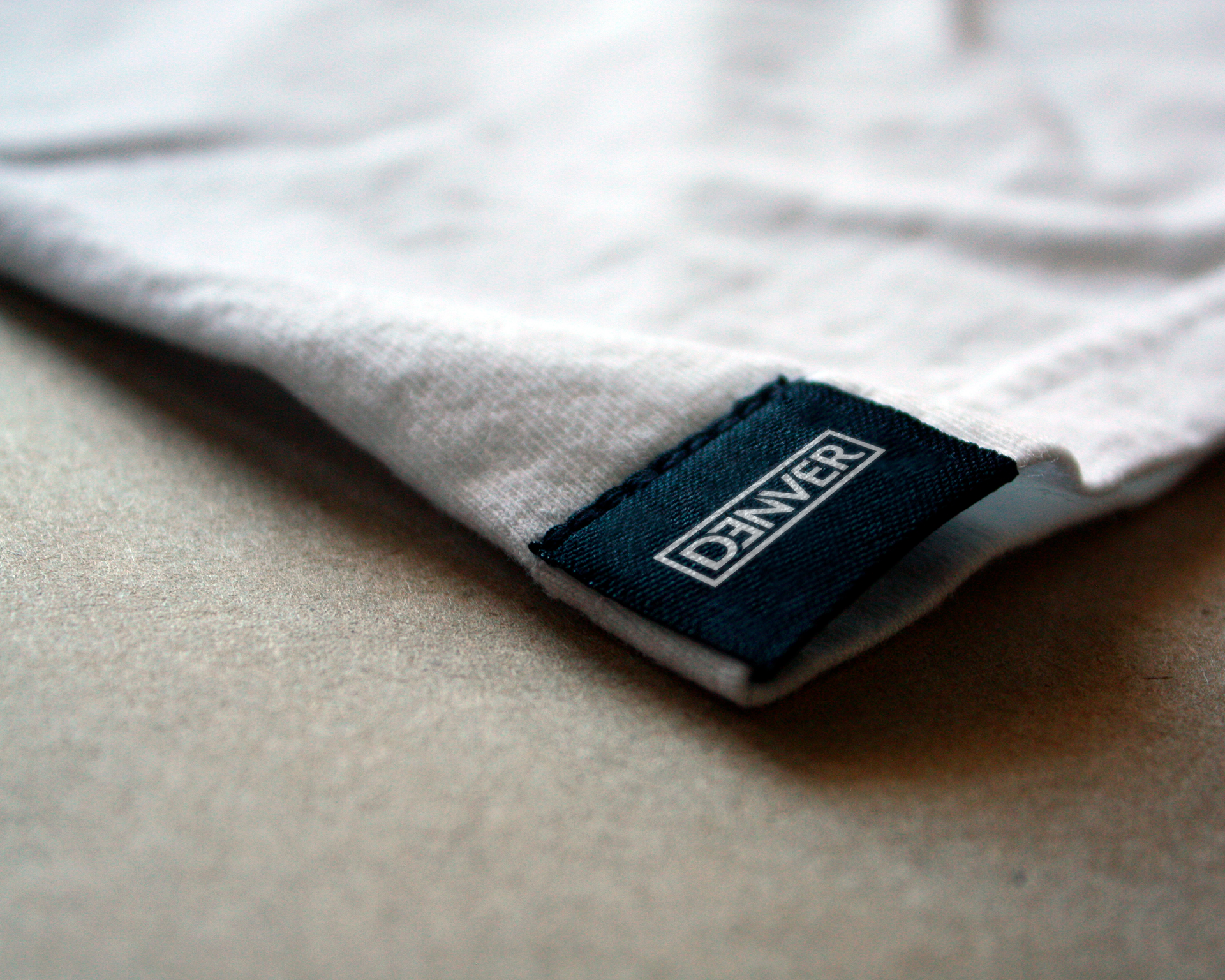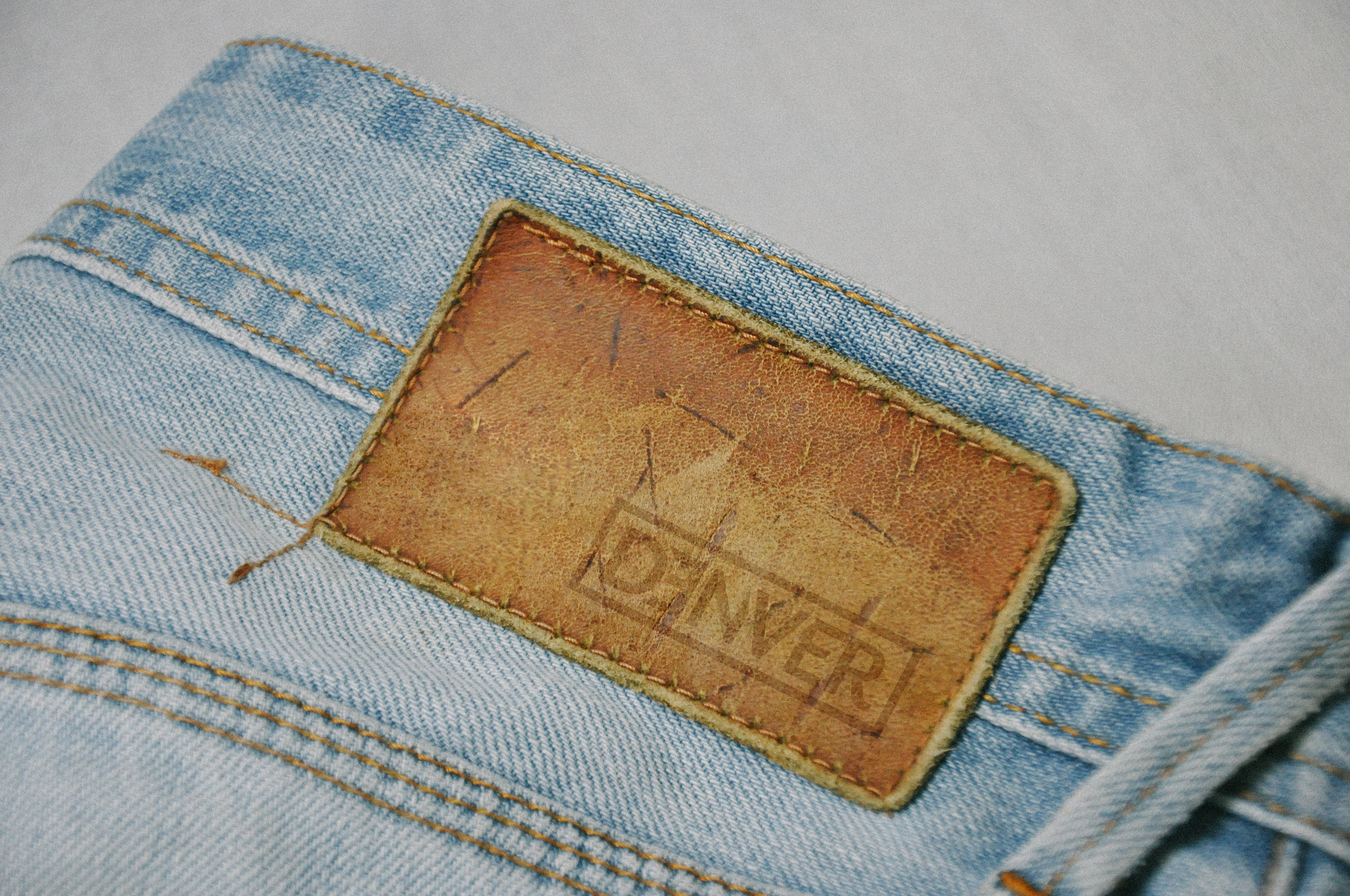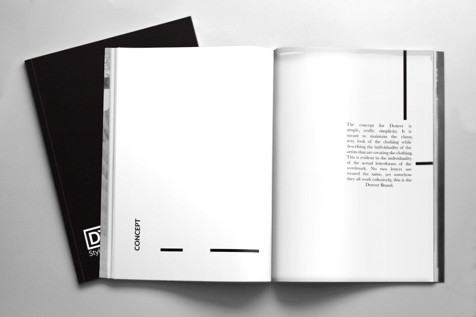

The Denver brand as it was did not look classy or unique enough. The challenge was to show the individuality of artists that design the shirts while maintaining the high end quality feel of the brand.
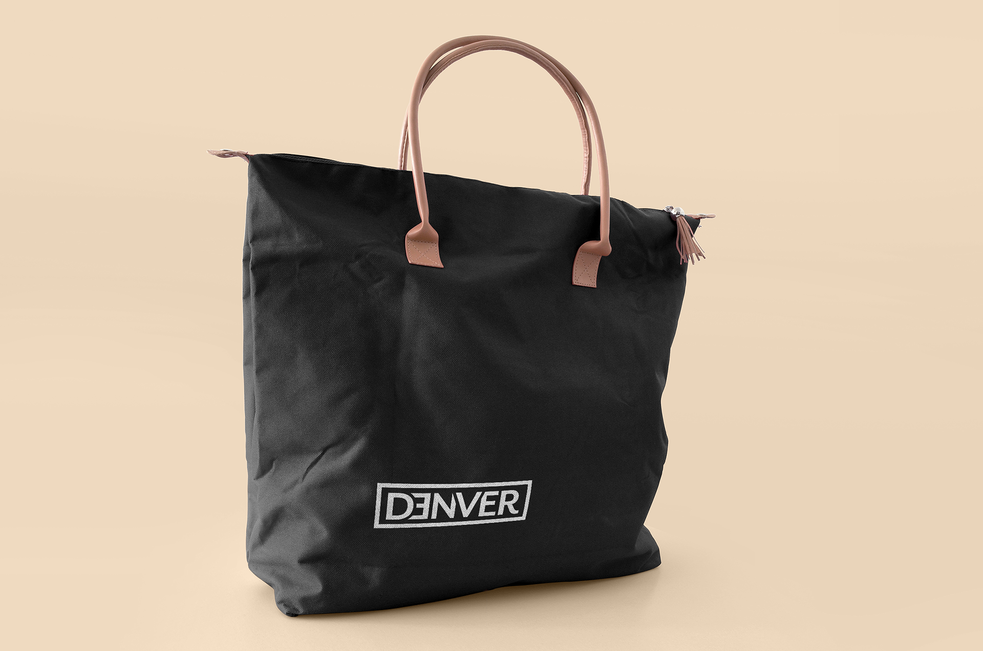
This was accomplished through the letterforms. All letters are different and unique. The V stands out to show individuality. They are all placed in the box to show that even though they are in the same design area, they are unique, just as anyone who wears the clothing.